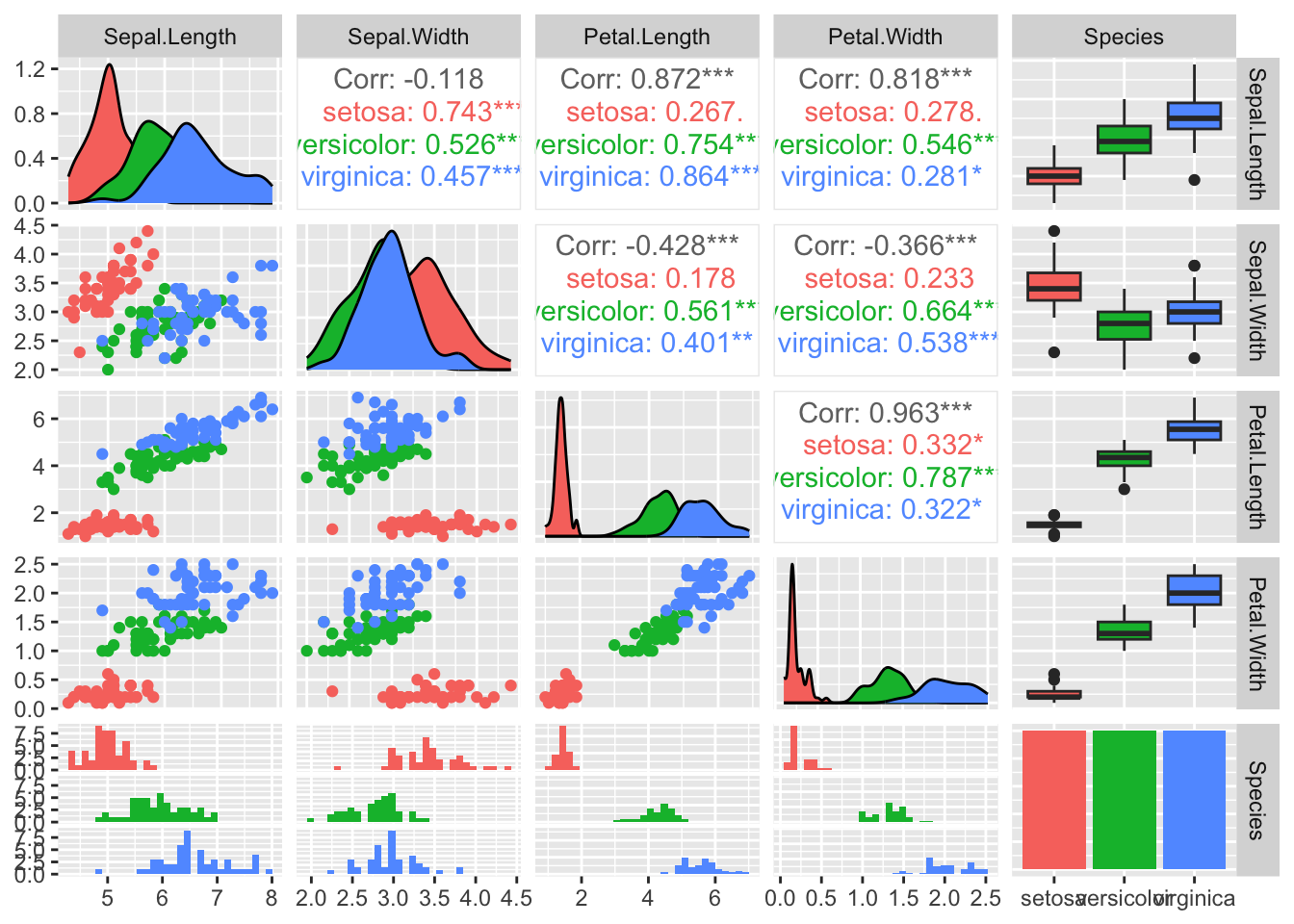
4 - Visualization of multivariate data

Author

Peter Nutter

Published

Sunday, May 5, 2024

Introduction

  • Interquantile Range (IQR): A measure of statistical dispersion, equal to the difference between the 75th and 25th percentiles, or between upper and lower quartiles.
    • Medians of the lower and upper half of the data.
  • Variance vs IQR:
    • Sample variance is sensitive to outliers.
    • IQR is more robust to outliers or any other quantile-based measure.
  • Standardisation can potentially worsen the problem of outliers - visualisation needed:
    • Normalisation: Subtracting the mean and dividing by the standard deviation.
    • Min-max scaling: Subtracting the minimum and dividing by the range.
    • Both depend on the outliers.
  • Sample Correlation is also calculated with ( n-1 ):
    • Suffers from the same potential issues as sample variance.
    • Pearson’s product-moment correlation coefficient.
    • Only measures linear association.
    • Visualisation is necessary to spot non-linear relationships.
  • Spearman’s Correlation Coefficient:
    • Pearson’s correlation applied to rank variables.
    • More robust to outliers.
    • Measures monotonic relationships (not necessarily linear).
data(iris)
dim(iris)
[1] 150   5
summary(iris)
  Sepal.Length    Sepal.Width     Petal.Length    Petal.Width   
 Min.   :4.300   Min.   :2.000   Min.   :1.000   Min.   :0.100  
 1st Qu.:5.100   1st Qu.:2.800   1st Qu.:1.600   1st Qu.:0.300  
 Median :5.800   Median :3.000   Median :4.350   Median :1.300  
 Mean   :5.843   Mean   :3.057   Mean   :3.758   Mean   :1.199  
 3rd Qu.:6.400   3rd Qu.:3.300   3rd Qu.:5.100   3rd Qu.:1.800  
 Max.   :7.900   Max.   :4.400   Max.   :6.900   Max.   :2.500  
       Species  
 setosa    :50  
 versicolor:50  
 virginica :50  


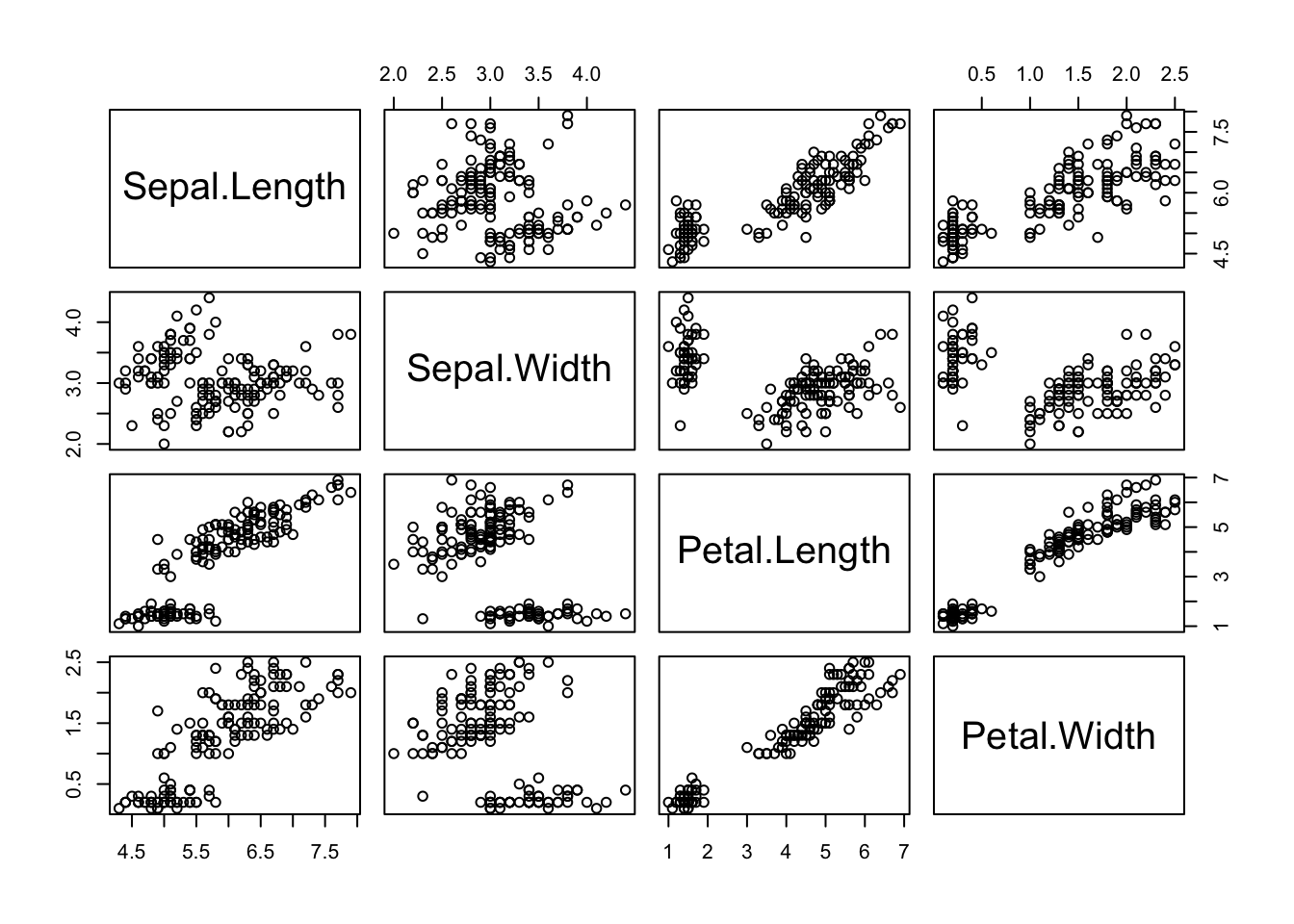
# Shows pairwise scatter plots without outliers
pairs(iris[, 1:4])

# ggplot2 pairs
library(ggplot2)
library(GGally)
Registered S3 method overwritten by 'GGally':
  method from   
  +.gg   ggplot2
ggpairs(iris, columns = 1:5, aes(colour = Species))
`stat_bin()` using `bins = 30`. Pick better value with `binwidth`.

# Run only the first demo
# demo(persp)
# help(volcano)
dim(volcano)
[1] 87 61
z <- volcano
x <- 1:dim(z)[1]
y <- 1:dim(z)[2]
persp(x, y, z, theta = 30, phi = 30, expand = 0.5, col = "lightblue")

Contour Plot

contour(x, y, z)

Other 2D Representations by Glyphs

palette(rainbow(12))
stars(USJudgeRatings,
    labels = abbreviate(case.names(USJudgeRatings)),
    key.loc = c(13, 1.5), len = 0.8,
    draw.segments = TRUE,
    main = "12-item scores for 43 Judges"
)

PCA

# install.packages('bootstrap')
library(bootstrap)

dim(scor)
[1] 88  5
summary(scor)
      mec             vec             alg             ana       
 Min.   : 0.00   Min.   : 9.00   Min.   :15.00   Min.   : 9.00  
 1st Qu.:30.00   1st Qu.:42.00   1st Qu.:45.00   1st Qu.:35.75  
 Median :41.50   Median :51.00   Median :50.00   Median :49.00  
 Mean   :38.95   Mean   :50.59   Mean   :50.60   Mean   :46.68  
 3rd Qu.:49.25   3rd Qu.:60.00   3rd Qu.:57.25   3rd Qu.:57.00  
 Max.   :77.00   Max.   :82.00   Max.   :80.00   Max.   :70.00  
      sta       
 Min.   : 9.00  
 1st Qu.:31.00  
 Median :40.00  
 Mean   :42.31  
 3rd Qu.:51.50  
 Max.   :81.00  
boxplot(scor)

Violin Plot

library(ggplot2)
# Convert the scor dataset to long format for ggplot
scor_long <- tidyr::pivot_longer(as.data.frame(scor), cols = everything(), names_to = "Variable", values_to = "Value")
scor_long
# A tibble: 440 × 2
   Variable Value
   <chr>    <dbl>
 1 mec         77
 2 vec         82
 3 alg         67
 4 ana         67
 5 sta         81
 6 mec         63
 7 vec         78
 8 alg         80
 9 ana         70
10 sta         81
# ℹ 430 more rows
# Create the ggplot object with specified aesthetics
theplot <- ggplot(scor_long, aes(x = Variable, y = Value))

# Add violin plot and boxplot to the ggplot object
theplot +
    geom_violin(fill = "lightblue", color = "darkblue") +
    geom_boxplot(width = 0.1, fill = "lightgray", color = "darkred")

Correlation Plot

# install.packages('corrplot')
library(corrplot)
corrplot 0.92 loaded
cormat <- cor(scor)
corrplot(cormat, type = "upper", addCoef.col = "black", diag = FALSE)

PCA Interpretation

  • Arrows close to each other indicate high correlation and similar subjects.
  • The direction of the arrow indicates that the correlation is positive for all the subjects.
pc <- prcomp(scor, center = TRUE, scale = TRUE)
summary(pc)
Importance of components:
                          PC1    PC2     PC3     PC4     PC5
Standard deviation     1.7835 0.8600 0.66706 0.62281 0.49658
Proportion of Variance 0.6362 0.1479 0.08899 0.07758 0.04932
Cumulative Proportion  0.6362 0.7841 0.87310 0.95068 1.00000
biplot(pc)

Excercise 5

State dataset

# help(state)
statedata <- as.data.frame(state.x77)
names(statedata) <-
    c("population", "income", "illiteracy", "lifeexp", "murder", "hsgrad", "frost", "area")
attach(statedata)
head(statedata)
           population income illiteracy lifeexp murder hsgrad frost   area
Alabama          3615   3624        2.1   69.05   15.1   41.3    20  50708
Alaska            365   6315        1.5   69.31   11.3   66.7   152 566432
Arizona          2212   4530        1.8   70.55    7.8   58.1    15 113417
Arkansas         2110   3378        1.9   70.66   10.1   39.9    65  51945
California      21198   5114        1.1   71.71   10.3   62.6    20 156361
Colorado         2541   4884        0.7   72.06    6.8   63.9   166 103766

We are interesting in studying the relationship of illiteracy to income, high school graduation rates, life expectancy and murder rates. Construct four scatterplots, one each for illiteracy versus each of the other four variables. Use as plotting symbol the abbreviated state names in state.abb. Construct the appropriate Spearman correlations for each plot. Describe the results in terms of specific units, indicate by name any unusual outliers, and comment on what the results mean for society.

plot(illiteracy, income, pch = "", las = 1)
text(illiteracy, income, labels = state.abb)

cor(illiteracy, income, method = "spearman")
[1] -0.3145948
plot(illiteracy, hsgrad)
text(illiteracy, hsgrad, labels = state.abb)

cor(illiteracy, hsgrad, method = "spearman")
[1] -0.6545396
# png("stars_plot.png", width = 8, height = 6, units = "in", res = 300)
# quartz( dpi = 300)
# par(cex = 4)
stars(statedata,
    key.loc = c(10, 1.5),
    draw.segments = T, cex = .3
)

# dev.off()
library(ggplot2)
sta <- cbind(state.abb, statedata, state.region)
colnames(sta)[1] <- "State" # Rename first column
colnames(sta)[10] <- "Region" # Rename the 10th column
sta$region <- tolower(state.name) # Lowercase states' names
states <- map_data("state") # Extract state data
map <- merge(states, sta, by = "region", all.x = T) # Merge states and state.x77 data
map <- map[order(map$order), ] # Must order first
ggplot(map, aes(x = long, y = lat, group = group)) +
    geom_polygon(aes(fill = murder)) +
    geom_path() +
    scale_fill_gradientn(colours = rev(heat.colors(10))) +
    coord_map() +
    labs(x = "Longitude", y = "Latitude") +
    guides(fill = guide_legend(title = "Murder Rate"))

Run a pca analysis and biplot on the eight attributes of statedata and summarize.

pcstate <- prcomp(statedata, center = T, scale = T)
summary(pcstate)
Importance of components:
                          PC1    PC2    PC3     PC4     PC5     PC6     PC7
Standard deviation     1.8971 1.2775 1.0545 0.84113 0.62019 0.55449 0.38006
Proportion of Variance 0.4499 0.2040 0.1390 0.08844 0.04808 0.03843 0.01806
Cumulative Proportion  0.4499 0.6539 0.7928 0.88128 0.92936 0.96780 0.98585
                           PC8
Standard deviation     0.33643
Proportion of Variance 0.01415
Cumulative Proportion  1.00000
par(cex = 0.6)
biplot(pcstate,
    pc.biplot = TRUE, las = 1,
    col = c("darkslategrey", "firebrick")
)